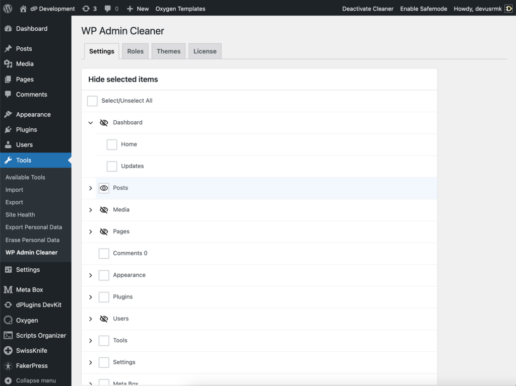
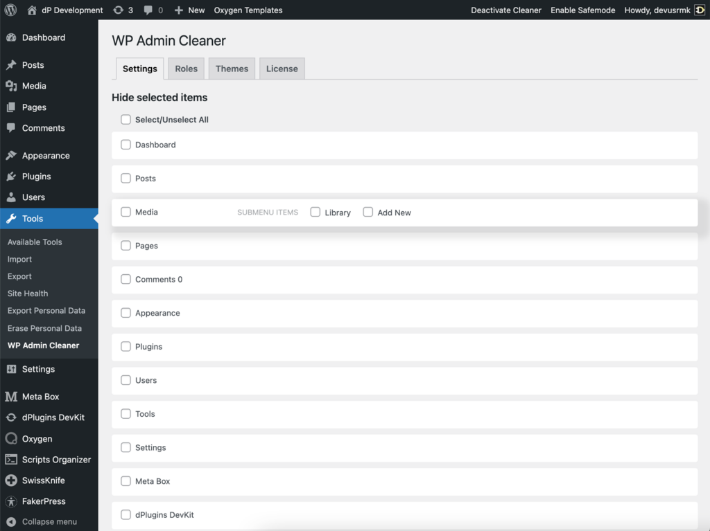
With latest release we updated Settings tab UI and UX
- The check boxes have been replaced with a hidden eye icon that indicates whether an item is shown or hidden.
- They are now larger and easier to hit.
- The content of the Settings tab is unified and now have the same card format as the rest of the tabs.
- The submenus have been moved under the accordion and can be expanded by clicking the arrow on the left. After studying UX we found that not many users manage the submenu items, so we reduced the priority of these items.

