Fluid Spacing and Type Scale in Tailwind CSS with CSS Variables
If you size headings and spacing by hand for each breakpoint, every new screen size means more classes to change. In this live session with Alex Baracella from Nintu, we build a fluid spacing and type scale in Tailwind CSS from CSS variables and clamp(), then map it into the Tailwind config. You set it up in a few minutes and change it later in one place, and it works across your whole site.
We also show an early preview of loose class autocomplete in Plain Classes for Gutenberg, and Alex shows where the Nintu design sets for Bricks Builder and Winden are heading.
Preview: loose class autocomplete in Plain Classes for Gutenberg
With a big utility framework, it's hard to remember whether a color class starts with text- or bg-. The Plain Classes preview uses loose autocomplete: you type part of a name, like blue or emerald, and it lists every class that contains it.
In the video we select a Heading block and type into the Plain Classes field in the block sidebar. Classes like bg-blue-50 text-emerald-500 apply as you pick them, and the editor updates right away. The field is a plain text string, not a list of tags, so you can edit it like normal text.
The plan is to go beyond Tailwind CSS and also pull in the custom classes you've already typed on your site. Then you could mix Tailwind with your own framework. That part is still planned and isn't shown working yet.
Why use CSS variables for fluid spacing
Tailwind's default spacing scale has many fixed steps, and none of them are fluid. Instead of piling on responsive variants, Marko defines a few fluid values as CSS variables and points Tailwind at them. Change a variable and every utility that uses it updates across the site.
The demo uses Tailwind Play (v3.2.1), so there's no WordPress install or compile step. The config works the same way in Winden.
Generate the variables with the Fluid Type Scale Calculator
The Fluid Type Scale Calculator (fluid-type-scale.com) writes the clamp() values for you. It also stores every setting in the page URL, so you can save or share your exact scale.
- Under Minimum (Mobile), set Base font size (pixels) to
16, Screen width (pixels) to400and Type scale ratio to1,25. - Under Maximum (Desktop), set Base font size to
20, Screen width to1680and Type scale ratio to2. - In Type scale, set All steps to
small,base,medium,largeand Baseline step tobase. - Change Variable prefix from
font-sizetospace, because these values are for spacing. - Uncheck Show output in rems if you want to read the values in pixels while testing. With base 20 and ratio 2, you can see the 20 / 40 / 80 steps.
- Click Copy to clipboard and paste the output into a
:rootrule in your CSS.
@tailwind base;
@tailwind components;
@tailwind utilities;

:root {
  --space-small: clamp(12.8px, -0.22vw + 13.68px, 10px);
  --space-base: clamp(16px, 0.31vw + 14.75px, 20px);
  --space-medium: clamp(20px, 1.56vw + 13.75px, 40px);
  --space-large: clamp(25px, 4.3vw + 7.81px, 80px);
}
Tip: paste the calculator URL into your CSS as a comment so you can come back and fine-tune the scale mid-project. The file is plain CSS, so use /* */ for the comment. In the video, a // comment causes an "Unknown word" CSS error.
Map the variables in the Tailwind config
Next, tell Tailwind to use the variables. If you put spacing directly under theme, it replaces Tailwind's default spacing scale.
/** @type {import('tailwindcss').Config} */
module.exports = {
  theme: {
    spacing: {
      'small': 'var(--space-small)',
      'base': 'var(--space-base)',
      'medium': 'var(--space-medium)',
      'large': 'var(--space-large)',
    },
    extend: {
      // ...
    },
  },
  plugins: [],
}
The Tailwind docs (Customization → Spacing) list what the spacing scale feeds: padding, margin, width, height, maxHeight, gap, inset, space and translate. So one set of variables gives you fluid gap-large, p-medium, m-small and more. In the demo, we add gap-large to a grid and resize the preview, and the gap scales smoothly.
If the config has a typo, such as a missing comma, Tailwind Play shows a Config Error with the line number, so you can find it fast.
Extend or overwrite the Tailwind defaults?
This choice decides whether your team sees a short list of names or dozens of options.
- Overwrite (put the key directly under
theme): Tailwind drops its defaults and only your names exist. - Extend (put the key under
theme.extend): Tailwind keeps all its defaults and adds yours.
  theme: {
    extend: {
      spacing: {
        'small': 'var(--space-small)',
        'base': 'var(--space-base)',
        'medium': 'var(--space-medium)',
        'large': 'var(--space-large)',
      }
    },
  },
With extend, autocomplete shows gap-small, gap-base, gap-medium and gap-large mixed in with gap-80, gap-96, gap-px, gap-0.5 and the rest. Marko prefers to overwrite: you keep only the values your design actually uses, and nobody picks an off-scale value by mistake.
Fluid font sizes the same way
Tailwind's default font-size names (text-sm, text-base, text-xl, text-2xl…) are hard to map to a design. Marko uses the same approach for typography, with names that match the content:
- Generate a second scale in the calculator and keep the prefix
font-size. - Paste the variables into
:root. - Under
theme, add afontSizeobject with your own names, such asfootnote,base,h6,h5and so on up toh1. - Point each name at a variable, for example
base: 'var(--font-size-base)'.
If you want to keep Tailwind's names and only make them fluid, overwrite fontSize with the same keys and swap the values for variables.
We hit a bug live: the config failed with SyntaxError: Invalid or unexpected token on the line with 2xl. The config is a JavaScript object, and a key that starts with a number, like 2xl or 3xl, must be in quotes. We didn't get to a fully working fluid font-size config on camera, so treat this part as the approach, not a finished setup.
Naming conventions you can reuse
It's often the naming, not the values, that makes a design system fall apart. If you only have H1–H6, the first hero banner gets an oversized H1, and soon blog headings get swapped around to fix the look. Marko suggests adding a separate step like "h-large" for hero banners so your base heading scale stays intact.
Once you settle on names like small, base, medium and large, you can reuse the same config file on every project and only change the values. Write down when to use each name, and the whole team works from the same rules.
Nintu design sets for Bricks Builder and Winden
Alex shows the Nintu template library for Bricks Builder. It has two tracks:
- Core: more creative sections (Content 01–09 and more) with decorative lines and layouts that break the grid on purpose.
- Essentials: plain layouts and grid systems with no styling and no images.
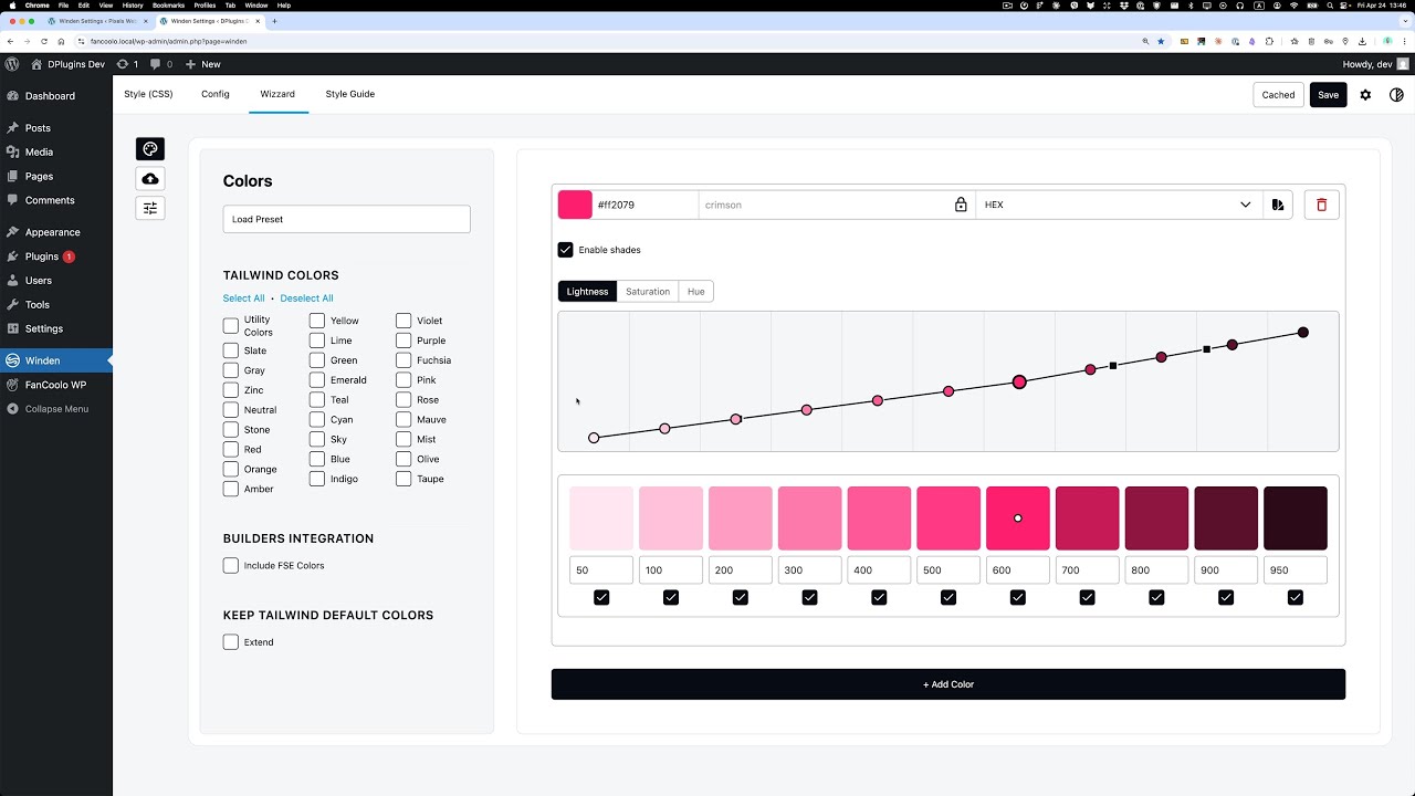
The workflow: a client sets their primary and neutral colors in Winden. The Winden Settings screen shows a Tailwind config with p and n color shades from 50 to 900. Then they paste a Nintu section into a blank Bricks page, and it picks up their brand colors. Icons come across styled. Images don't, so you swap those in yourself.
Alex found that rebuilding the same layouts with the plain Bricks UI takes far more clicking than using Tailwind classes. One example: inset-0 instead of setting absolute position and then each of top, right, bottom and left. That's why the plan is to build one version for Winden instead of a second Bricks-only version. The Essentials may become a free set, possibly with a sandbox install where people can try a few elements without setting anything up. Both are plans, not released.
Who is this for
- Tailwind CSS users who want fluid spacing and headings without writing responsive variants on every element.
- Winden users who want a short, named scale in their config that the whole team can remember.
- Gutenberg builders who want to see where class autocomplete in Plain Classes is heading.
- Bricks Builder agencies who want brand-colored templates that adapt through a Winden config.
FAQ
How do I make Tailwind CSS spacing fluid?
Generate clamp() values as CSS variables, for example with the Fluid Type Scale Calculator using the prefix space. Add them to :root, then set theme.spacing in your config to values like 'var(--space-base)'. Padding, margin, gap, width and the other spacing utilities then scale with the viewport.
Should I extend or overwrite the Tailwind theme?
Extend (theme.extend) keeps all Tailwind defaults and adds your values. Overwrite (directly under theme) replaces them. In the video we prefer overwriting, so only the values your design uses appear in autocomplete.
Why does my Tailwind config throw "Invalid or unexpected token" on 2xl?
The config is a JavaScript object. A key that starts with a number, like 2xl, has to be in quotes.
Can I keep the same fluid scale across projects? Yes. The calculator saves your settings in its URL, and you can keep that URL as a comment in your CSS. Reuse the same names in every config and only change the values per project.
Do I need a WordPress install to test this? No. We test everything in Tailwind Play first. You can open the playground config from the video at play.tailwindcss.com, then move the same config into Winden.
More WordPress tools for Tailwind CSS and Gutenberg → dplugins.com