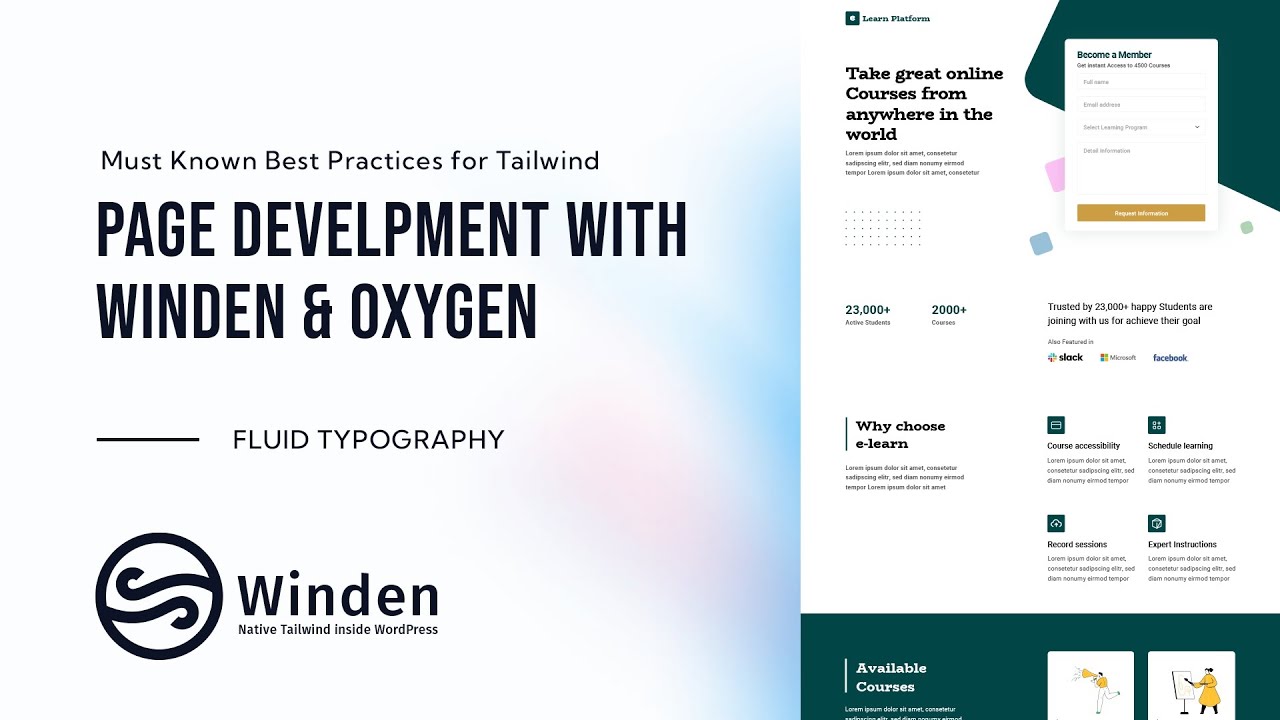
Fluid Typography Scale from a Design with Utopia and Winden
When a designer hands you a finished layout, the font sizes are spread across dozens of layers: 50 here, 18 there, 35 and 40 somewhere else. It's hard to tell which ones are headings and which are one-offs. In this video we put every font size from the design side by side, fit them to a fluid type scale with Utopia, and then move the base size and ratio into Winden. Your Tailwind CSS typography then scales smoothly between screen sizes and still matches the design.
Lay out every font size from the design
If you weren't involved in the design from the start, you won't remember which size belongs to which element, and you'll end up guessing in the code. The fix is to see every size at once before you write any CSS.
- In the design file (Sketch in the video), copy one sample of each text style onto an empty part of the canvas.
- Stack them from largest to smallest and write the role and size into each sample, for example .h1 (50px), .h2 (40px).
- Look for duplicates and outliers.
In this design the list came out as:
- .h1: 50px
- .h2: 40px
- .h3: 35px
- .h4: 30px
- .h5: 26px
- .h6: 22px
- p: 18px
- .footnote: 16px
Once the sizes were lined up, it was clear that "Become a Member" and "Trusted by 23,000+ happy Students" use the same 26px size. One is bold and the other is regular. That means you need one size, h5, plus a bold variant, not two separate styles.
Fit the sizes to a fluid scale in Utopia
A list of hand-picked pixel values doesn't respond to screen size. A modular scale does, but only if its steps land close to what the designer chose. Utopia's fluid type scale calculator lets you test that before you commit.
- Open the Utopia type scale calculator.
- Set the paragraph size as the base. Here the maximum Font size is 18, with Width 1140. The minimum is Font size 14 at Width 320.
- Check the Calculated Font Sizes table. It lists each Scale step at the minimum and maximum viewport widths.
- Change the maximum Type scale until the steps match your list. You can pick a preset or choose Custom to type your own ratio.
- If you run out of steps before you reach your largest heading, use Add a scale step to add one.
Here is how the iterations went in the video (maximum viewport column):
- 1.25: step 5 is 54.93, which is already too big for a 50px H1.
- Custom 1.228: step 5 hits 50.26, but the steps in between (22.10, 27.14, 33.33, 40.93) don't match the design well.
- 1.2 with a sixth step: 21.60, 25.92, 31.10, 37.32, 44.79, 53.75. Closer, but the top overshoots.
- Final scale: 18, 21.42, 25.49, 30.33, 36.10, 42.95, 51.12.
The final scale gives you roughly 22, 26, 30, 35 and 50 for h6, h5, h4, h3 and h1, which is close enough to the design. You can keep adjusting if you need a tighter match. The difference is that each size now comes from a formula instead of being a separate value.
Export the scale as CSS or Winden config
Once you're happy with the scale, you have two ways to use it.
Plain CSS: scroll down to Utopia's CSS Generator, tick Use clamp if you want clamp() values, copy the output, and assign the steps to your H1–H6 in your stylesheet.
Winden: you don't need the generated CSS. Copy the base font sizes and ratios into the fluidType settings of your Tailwind config. In the video the config is edited in VS Code (cdn.config.js) and then shows up in Winden's Tailwind Config (CDN) field:
fluidType: {

  settings: {
    fontSizeMin: 14, //Base Font on Minimum screen size
    fontSizeMax: 18, //Base Font on Maximum screen size
    ratioMin: 1.1,
    ratioMax: 1.19,
    screenMin: 400,
    screenMax: 1600,
    unit: 'px',
    prefix: ''
  }, // End of fluidType

  values: {
    'xs': [-2, 1.6],
    'sm': [-1, 1.6],
    'base': [0, 1.6],
    'lg': [1, 1.6],
    'xl': [2, 1.2],
    '2xl': [3, 1.2],
    '3xl': [4, 1.2],
    '4xl': [5, 1.1],
    '5xl': [6, 1.1],
    '6xl': [7, 1.1],
    …
fontSizeMax: 18 and ratioMax: 1.19 reproduce the final Utopia column (18 → 21.42 → 25.49 → … → 51.12). Each named size in values refers to a scale step, with base at step 0. The config uses unit: 'px'. The video notes that if you want rem values instead, you convert them and set the base so it still represents 18px.
Preview the whole scale
It's easier to check the whole scale at once than to click through pages. We use a small code snippet (to be published separately) that renders every step of the scale on one page. When you change the config and reload, the new sizes show up right away, with the pixel values listed at the bottom. That gives you a quick check against the design before you start building pages.
Who is this for
- Developers handed a finished design: turn a pile of inconsistent font sizes into a clear H1–H6 map before you write code.
- Winden and Tailwind CSS users: get a fluid type scale that matches the design by changing two numbers (base size and ratio) instead of hard-coding every size.
- Anyone writing responsive typography by hand: replace per-breakpoint font sizes with one fluid scale, as
clamp()CSS or as Winden config.
FAQ
How do I turn a designer's font sizes into a fluid type scale? List every size from the design next to each other, use the paragraph size as the base, then change the ratio in Utopia's type scale calculator until the calculated steps land close to the design's heading sizes.
What if the scale doesn't match the design exactly? It rarely will. Aim for close enough. In the video the final scale gives 51.12 for a 50px H1 and 30.33 for a 30px H4. Add scale steps or try a custom ratio until the important sizes line up.
Can I use the result without Winden?
Yes. Utopia's CSS Generator outputs the scale as CSS, optionally with clamp(), and you can assign those values to your headings directly.
Where do the Utopia values go in Winden?
Into the fluidType.settings object of your Tailwind config: fontSizeMin/fontSizeMax for the base size and ratioMin/ratioMax for the scale ratio at the smallest and largest screen.
Two text styles share a size but different weights. Do I need two sizes? No. In the example both the bold and regular 26px texts use the same h5 size. You only change the font weight.
Get Winden → dplugins.com