Oxygen Page Design with Tailwind CSS: A Full Winden Build
Turning a design file into a finished page often takes much longer than it should. Assets are too heavy, styles get repeated in every element, and mobile falls apart at the end. In this video we build a complete landing page from start to finish with Oxygen Builder and Tailwind CSS through Winden, in under two hours. You end up with a small set of reusable classes, a Tailwind config you can use again, and a page that already works on mobile.
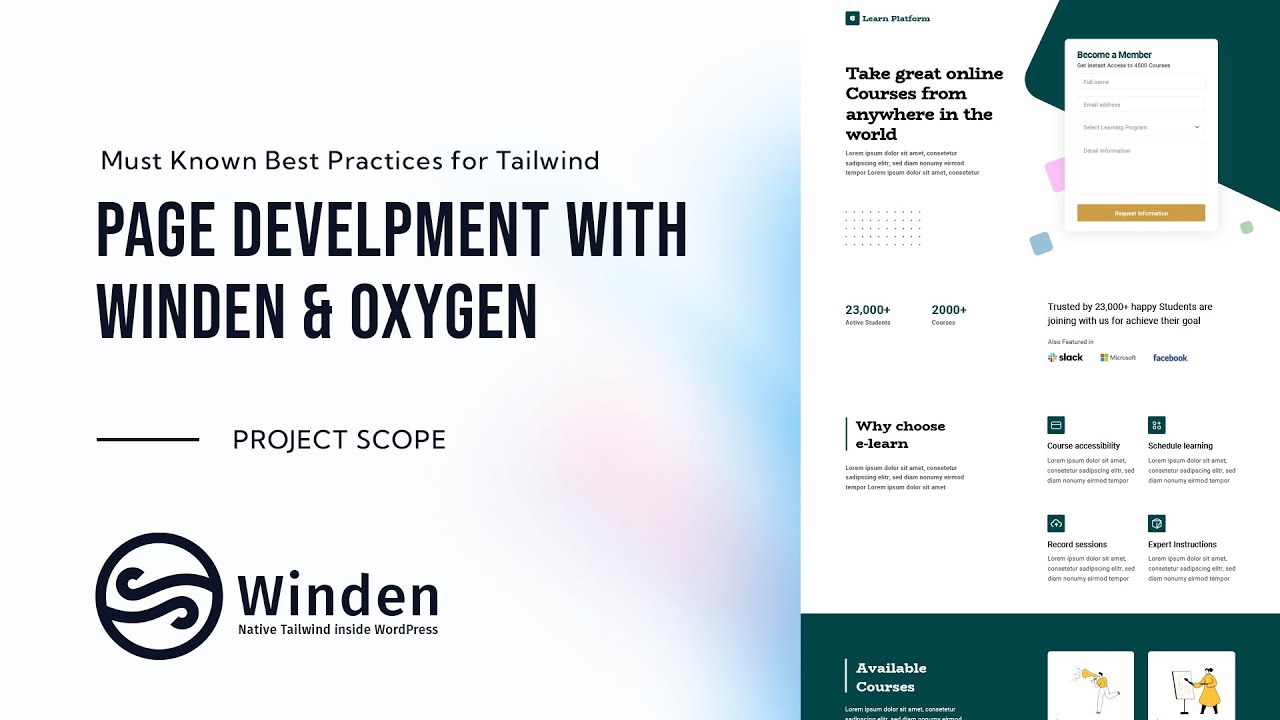
The page is a course landing page with a hero and signup form, stats, a "Why choose" section, course cards, pricing, testimonials and a closing form section. Every step below is one you can reuse on your own projects.
Project introduction
Large builds usually go wrong in the prep work, not in the builder. So before we open Oxygen, we plan four things: prepare and optimize the assets, prepare the content, set up CSS we can scale and reuse, and write a custom Tailwind configuration. The design itself lives in Sketch. With a bit of practice you can do the whole build in about an hour.
Asset preparation
If you export every graphic as SVG by default, you can end up with heavy files. Before exporting, check which format is actually smaller.
- In Sketch, export the detailed course illustrations both as SVG and as PNG at 2x for retina screens.
- Compare the file sizes. For the illustration we tested, the PNG was about 27 KB and the SVG about 279 KB.
- Run everything through ImageOptim. The PNG dropped to about 20 KB and the SVG only to about 170 KB. For detailed illustrations the 2x PNG is the clear choice.
- Use SVG for simple graphics like the logo, partner logotypes, the small feature icons and the dot grid. Those files stay small and sharp.
- We exported the four feature icons with their background included, so we don't need an extra div for each one.
The dot pattern shows up twice on the page, in dark and in white. We export it only once and switch the color later with a CSS filter, so there's one less file to upload. Always compress before you upload. ImageOptim cut many files by 40–60% in one pass.
WordPress SVG setup
The WordPress media library doesn't allow SVG uploads by default, so you need a plugin for that. We use SVG Support. It's simple, and its advanced mode includes a few useful extras:
- Go to Settings → SVG Support. With advanced mode on, you get options like sanitizing SVGs on upload and Minify SVG.
- Force Inline SVG? outputs SVG files inline. That's handy when one icon needs several colors, because you can recolor it with CSS and don't need a separate file for each color.
We leave force inline off for this build. Then we drag all the optimized assets into the media library.
Configuration and CSS
If you overwrite Tailwind's defaults, you lose utilities you'll want later. So we put the font family and colors under extend. We also add end-of-block comments so the config stays easy to scan. The brand color has a full set of shades, and there's a separate action color for buttons. We write the config in VS Code because there's more room than in the admin, then paste it into Winden, save and reload.
const FluidType = require('tailwindcss-fluid-type')

module.exports = {
  theme: {
    screens: {
      sm: '600px',
      md: '900px',
      lg: '1200px',
      xl: '1800px',
    }, // End of Screens

    container: {
      center: true,
    },

    extend: {

      fontFamily:{
        'title': ['Title', 'ui-serif', 'serif'],
      }, // End of fontFamily

      colors: {
        'brand': {
          …
          '500': '#024547',
          …
        },
        'action' : '#CC9D42',

      }, // End of colors

    }, // End of Extend

    fluidTypeSettings: {},
The global CSS starts with a few helpers that every section uses. The container is 90% wide, so content never touches the screen edges on phones. Sections get vertical padding that grows at each breakpoint. py-10 sets top and bottom padding in one class, so you don't have to write top and bottom separately at every size.
@tailwind base;
@tailwind components;
@tailwind utilities;

@layer components {
  .container {
    width: 90%;
    @apply max-w-6xl m-auto;
  }

  header,
  footer{
    @apply w-full;
  }

  section {
    @apply w-full py-10 md:py-16 lg:py-20;
  }
Building the layout
Testing layout ideas inside a page builder is slow. We mock up the structure in Tailwind Play first. There we add a temporary border border-blue-200 p-4 to every div so we can see each box. Looking at the design, the same few patterns repeat: a full-width section, a container, and a half, third or quarter grid. So we turn those into classes:
  .col--1-2{
    @apply grid md:grid-cols-2 gap-10;
  }
  .col--1-3{
    @apply grid md:grid-cols-3 gap-10;
  }
  .col--1-4{
    @apply grid grid-cols-2 md:grid-cols-4 gap-10;
  }
Tailwind is mobile first, so the columns stack by default and turn into a grid from md up. The quarter grid already shows two columns on mobile. When the course cards needed an offset, the simplest fix was an empty grid cell. We later hide that cell on small screens.
Content population
Most of the content is filled in inside Tailwind Play. We pick heading levels from the font sizes in the design (h1 at 50px, h2 at 40px, h3 at 35px and so on). Then we paste the HTML into Oxygen, and it arrives as real Oxygen elements. Even the empty <img> tags become Image elements, and you just pick the files from the media library. After that, the temporary border helper can go.
Global style application
Getting from design pixels to fluid type classes usually means guessing. We built a small typography preview for this. It's a code block added with a Scripts Organizer shortcode, and it shows every fluid-text-* class with its computed size in pixels. You can see right away which class matches a 50px or 40px heading. Then we set the headings globally:
  body{
    @apply text-gray-500;
  }

  h1, h2, h3, h4, h5, h6{
    @apply text-black;
  }

  h1, .h1{
    @apply fluid-text-5xl font-title mb-8;
  }

  h2, .h2{
    @apply fluid-text-4xl border-l-4 border-brand-500 pl-4  font-title mb-6;
  }

  h3, .h3{
    @apply fluid-text-3xl font-bold mb-2;
  }

  h4, .h4{
    @apply fluid-text-2xl font-bold mb-4;
  }

  h5, .h5{
    @apply fluid-text-xl mb-3;
  }

  h6, .h6{
    @apply fluid-text-lg font-medium mb-3;
  }
The left border on every h2 comes from the design. Because it's defined once here, every section title gets it for free.
Typography refinement
Small repeated tweaks are exactly what you shouldn't set by hand in each element. For those we add small classes: .sub-title (max-w-xs) for the intro text next to a section title, .text-small (fluid-text-sm) for labels like "Per month", and .box-icon (mb-4) for the feature icons. For one-off cases like the brand-colored stat numbers, we use utilities directly. The color comes from the config, so changing the brand color still happens in one place.
One bug worth knowing about: max-w-xs didn't work on the hero intro text. The text element had its tag set to strong, which is inline. Changing the tag fixed it. When a utility seems to do nothing, check the element's display type in the browser's dev tools.
Styling components
Cards look the same throughout the page, so we style them once:
  .card-brand{
    @apply text-gray-500 [&_p]:text-gray-500 [&_h4]:text-black p-6;
  }

  .card{
    @apply bg-white rounded-lg shadow-lg p-6 ;
  }
We also fix things as soon as we notice them. The partner logos had equal-width grid cells, which the design doesn't have, so they became flex flex-wrap with a gap. Fixing it right away is much cheaper than finding it at the end.
Card design implementation
The pricing cards and course cards share the same padding, rounded corners and shadow. We first had a separate .price-card class and then dropped it for the shared .card class. That's one class fewer to maintain. The empty grid cell next to the course cards gets hidden, plus a block class at the larger breakpoint, so it only takes up space where the offset layout needs it.
Section styling and forms
The "Buy now" buttons, and later the form's submit button, use one button class:
  .cta-primary{
    @apply bg-action !text-white rounded-lg w-full block mt-8 p-4 text-center;
  }
The ! prefix makes the text color important so it beats the link color. block is needed because the button is a link. The "Popular" badge sits in a wrapper with flex justify-between items-start and uses text-small bg-orange-400 !text-white py-0 px-2 rounded-full.
Testimonials and graphics
The quote marks around the testimonial cards look like extra markup, but they're just pseudo-elements on one class. The card gets card card-testimonial, and the SVG quote icon we uploaded earlier becomes the background:
  .card-testimonial{
    @apply relative;
  }

  .card-testimonial::before{
    @apply content-[''] block w-10 h-10 bg-black absolute -top-5 left-4;
    background: url('https://your-site.local/wp-content/uploads/2022/07/Icon-metro-quote.svg') center center no-repeat;
  }

  .card-testimonial::after{
    @apply content-[''] block w-10 h-10 bg-black absolute -bottom-5 right-4;
    background: url('https://your-site.local/wp-content/uploads/2022/07/Icon-metro-quote.svg') center center no-repeat;
  }
The avatar and name row uses flex with items-center and a gap, and the image is rounded-full. We didn't add classes to the testimonial internals on purpose. In a real project this content usually comes from a repeater (Oxygen's repeater with a custom post type, ACF or Meta Box), so you style it once anyway.
Contact form integration
Form plugins bring their own styles, and overriding them is tedious. We build the form in Fluent Forms with the fields Full name, Email, Select Learning Program and Your Message. We use placeholders instead of visible labels, and we give the submit button our existing cta-primary class. We removed Fluent Forms' own button class, so there's nothing to override. The form goes into Oxygen with its shortcode, inside a card wrapper with a max width.
The large rotated shape behind the hero form is a plain div. It isn't an exported graphic, because a rounded square is too simple to need an SVG:
bg-brand-100 w-[800px] h-[800px] rounded-[50px] -top-[50%] rotate-[25deg] absolute -z-50
Its parent is relative, and the section gets overflow-hidden so the shape doesn't cause horizontal scrolling. The white dot grid is the same SVG as the dark one, recolored with Tailwind's invert and contrast filter utilities.
Final checks and mobile
Most of the page already worked on mobile, because the column classes were mobile first from the start. The main fix was the hero: on small screens we hide the decorative shape (hidden with block at a larger size). That keeps the text readable and puts the signup form right up front with strong contrast.
None of this depends on Oxygen. The custom typography, config, global classes and shortcode-based form work the same way in Bricks Builder or Gutenberg.
Who is this for
- Oxygen Builder users new to Tailwind CSS who want to see a real page built with Winden from start to finish, not isolated tips.
- Freelancers turning client designs into WordPress pages who want a repeatable process: optimized assets, a reusable config, and global classes instead of per-element styling.
- Anyone whose mobile layout breaks at the end of a project. Building mobile first with a few column classes makes the final check quick.
FAQ
Should I export illustrations as SVG or PNG for WordPress? Compare both. In this build, a detailed illustration was about 170 KB as an optimized SVG and about 20 KB as a 2x PNG, so PNG won. Use SVG for simple graphics like logos, icons and patterns, and run everything through an optimizer like ImageOptim before uploading.
How do I upload SVG files to the WordPress media library? WordPress blocks SVG uploads by default, so you need a plugin. We use SVG Support, which can also sanitize and minify SVGs and output them inline so you can recolor them with CSS.
Why put colors and fonts under extend in the Tailwind config?
Anything under extend is added to Tailwind's defaults and doesn't replace them. You keep the full default palette and font stacks and still get your brand, action and title values.
How do I style a Fluent Forms button with Tailwind CSS?
Add your own class, like cta-primary, to the submit button and remove the plugin's default button class. The button then uses the same styles as the rest of your site, and you don't need any overrides.
Does this workflow only work with Oxygen Builder? No. The config, global CSS and shortcode-based parts work the same way in Bricks Builder or Gutenberg with Winden.
Get Winden → dplugins.com