Plan a Tailwind CSS Page Layout from a Design: Oxygen Series Intro
If you start coding a page before you look at its structure, you end up writing a new layout for every section. That means more classes, more wrappers and more places to fix later. This intro to our series on building a full e-learning landing page with Tailwind CSS in Oxygen Builder shows how we read the design first and find the column patterns that repeat. That way the page can be built from a few layouts you reuse, not a new one for each section.
The design we are building
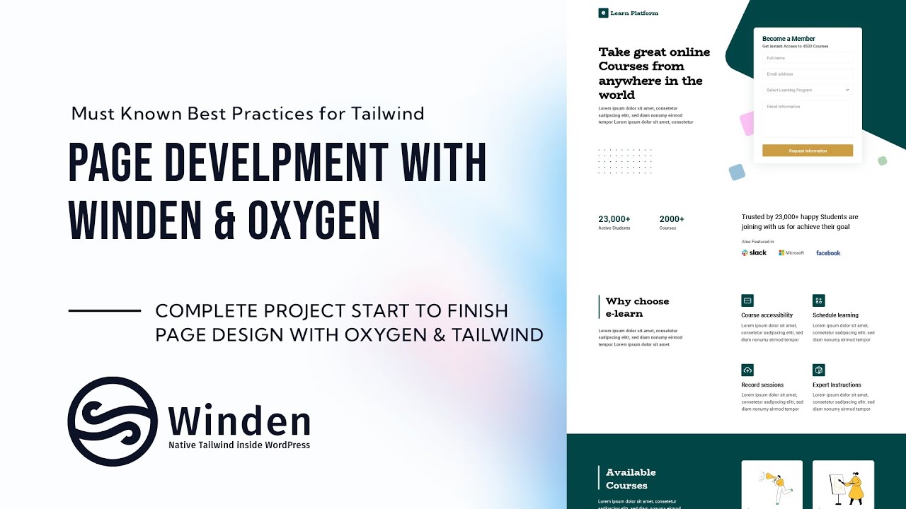
A practice project only teaches you something if it looks like real client work. So we use a complete landing page for an e-learning platform ("Learn Platform"), opened in Sketch. It has:
- A hero with a headline and a Become a Member form (Full name, Email address, Select Learning Program, Detail Information, Request Information button)
- Stats (23,000+ Active Students, 2000+ Courses) and an "Also Featured in" logo row
- Why choose e-learn with four feature items
- Available Courses cards on a dark background
- Pricing with two plans
- Testimonials
- A second Become a Member form next to a closing headline
Turn on the grid and find the repeating layouts
Most pages use only a few column splits, but that's hard to see when you only look at the finished visuals. Turning on the layout grid in the design tool shows the columns under every section, so you can tell which splits repeat.
Here's what the grid shows:
- Half and half. The hero and several other sections split into two equal columns.
- Quarters. Some areas can be read as one fourth plus a half. You could also wrap the content in a div and use halves again.
- Spanning and offset columns. In one row, one item takes a quarter, another spans two columns, and another is offset by one column.
- Thirds. Further down, one part takes one third and the rest is split into halves.
- Less than half. One block looks like a half but is a little narrower. It needs its own handling, and we cover that later in the series.
Once you know these patterns, you can build a small set of layouts and reuse them across the page. You don't have to start over in every section.
What else the series covers
The layout isn't the only thing a real page needs. The design also includes:
- A custom font that we have to include on the site
- Icons in the feature section
- A form plugin (Fluent Forms) for the membership form. We'll show how to style form elements you can't reach directly from the Oxygen structure panel.
- Repeaters, which may be used for repeating content such as the course cards
- The same form twice, at the top and bottom of the page, so we'll look at how to reuse it instead of building it twice
We plan to cover mobile too if there's time. Tailwind CSS is mobile-first, so most of the responsive work gets done as we build.
Why the series is split into short parts
One long build video is hard to follow and hard to come back to. So we split the series into short parts that you can watch when you have time and rewind to the step you need.
Who is this for
- Oxygen Builder users who want to build real pages with Tailwind CSS through Winden
- Developers who turn static designs into WordPress pages and want a repeatable way to plan the layout
- Anyone who needs to style third-party form plugins like Fluent Forms beyond what the builder exposes
FAQ
How do I figure out the layout of a design before writing Tailwind classes? Turn on the layout grid in your design tool and go through the page section by section. Note which splits repeat (halves, quarters, thirds) and which sections need offsets or spanning columns. Then build those layouts once and reuse them.
Which tools does this series use? The design is in Sketch. The page is built in Oxygen Builder with Tailwind CSS through Winden. The forms use Fluent Forms.
Can I style Fluent Forms fields that aren't in the Oxygen structure panel? Yes. That's one of the topics in the series: styling form elements you can't reach from the structure panel.
Will the page be responsive? Tailwind CSS is mobile-first, so responsive styles are part of the build. We plan to cover mobile specifically if there's time.
Get Winden → dplugins.com