Winden 3.3.0
Winden's new Wizard: a friendlier front door to Tailwind in WordPress" date: 2026-05-26 slug: winden-wizard-release author: Marko Krstić tags: [winden, release, tailwind, wordpress, ux] excerpt: "The latest Winden release puts the Wizard front and centre, ships smarter color shades that respect your brand color's natural position, and adds fine-tuning controls for saturation and temperature.
https://youtu.be/gbrQp1YnKsc?si=m0xkOIG5fRhEEuyX
Winden's new Wizard: a friendlier front door to Tailwind in WordPress
Quick note on the latest Winden release. The headline change: when you open Winden for the first time, the Wizard is now the first thing you see. The goal is simple — help people who don't want to write Tailwind config by hand get to a working palette and type scale without touching code.
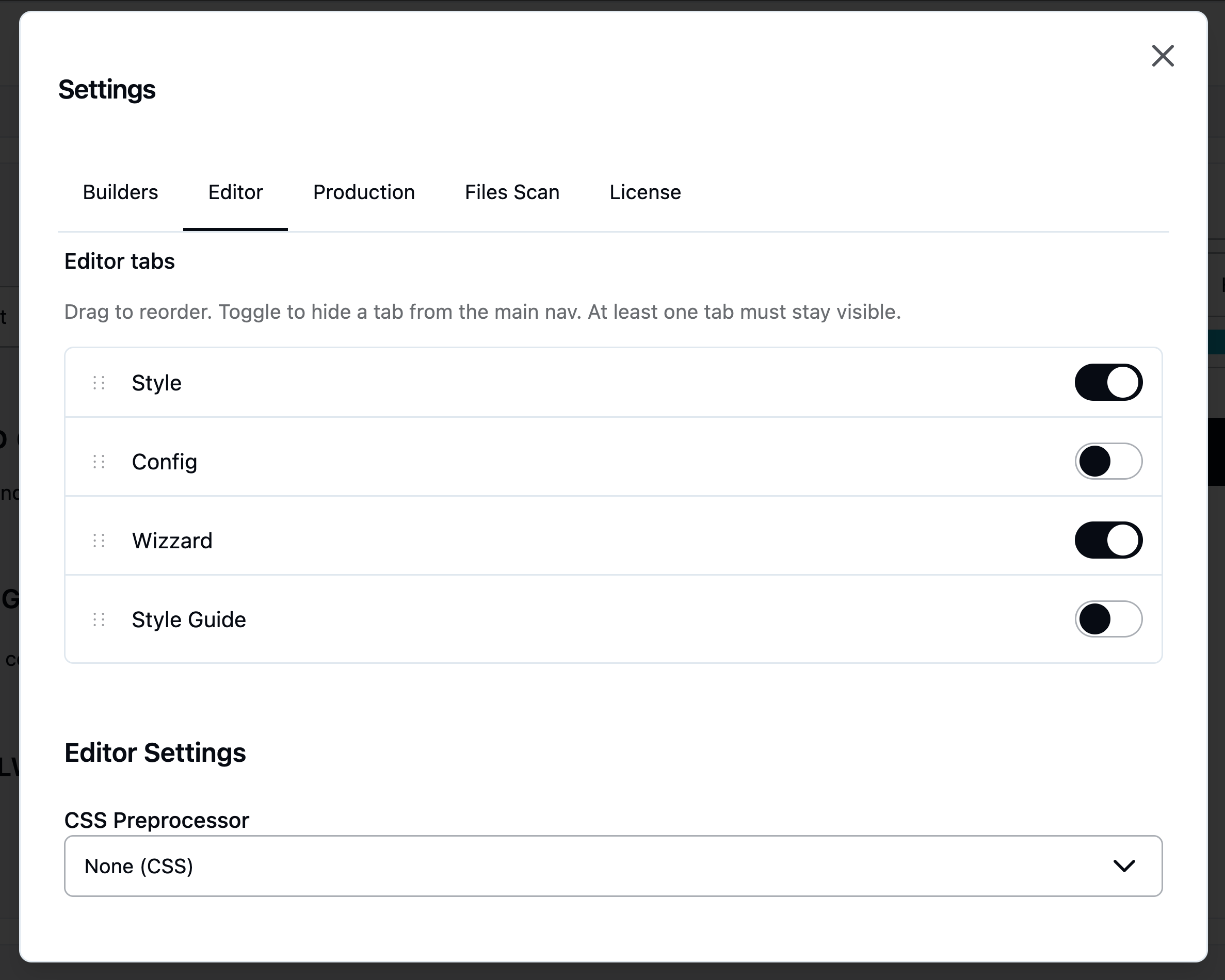
The Wizard is the new front door
Nothing is active in the Wizard by default. You open Settings, pick the pieces you actually need, and the Wizard adapts to that. Most users won't have to leave it. The editor reflects the same idea. Config is now legacy — the Style tab and the Wizard cover almost everything you used to do there. If you don't need Config, close the tab. Same for the Style Guide. Once both are disabled, you're left with just the Wizard, which is the point.
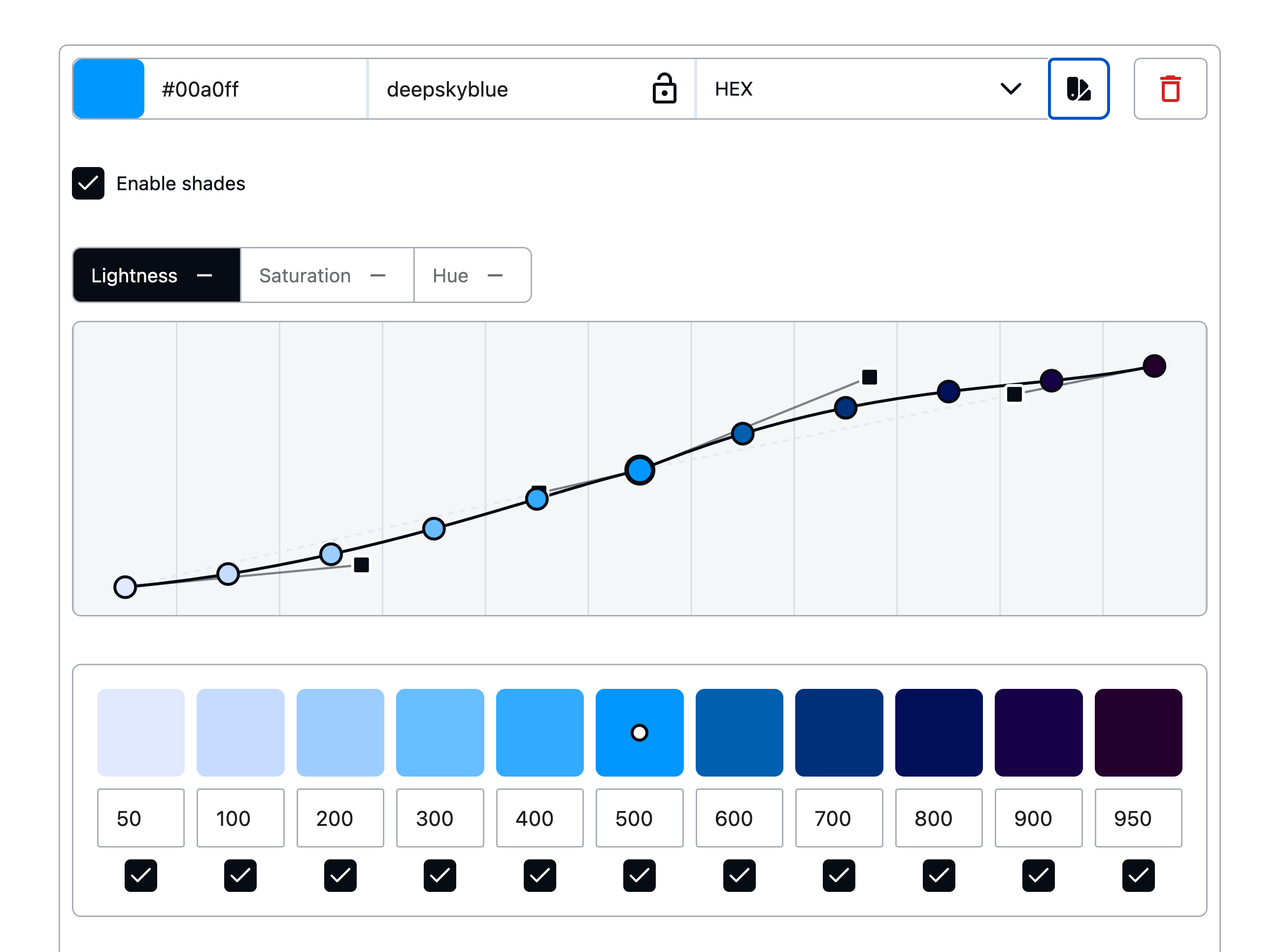
Smarter color shades
This is the change I spent the most time on, and it's worth explaining why it's different. Most plugins handle a brand color by taking it as the base and generating shades on either side — a few lighter, a few darker. That sounds fine until your brand is a deeper coral, or a pale mint. Then everything gets pushed in one direction: you end up with a palette that's mostly lighter than your brand, or mostly darker, with the shade you actually picked floating at one end of the range. Winden does it differently now. When you expand the shades, a dot points to where your current color sits inside the full range. Change the color and the dot slides left or right to show where it lands. Internally, Winden maps the color you chose to the closest matching shade slot and overrides that one — so a dark coral lands at 700 or 800, and the lighter and darker shades fill in naturally around it. Your brand color keeps its position; everything else accommodates.
Fine-tuning handles
The handles are intentionally subtle, but they're there once you go looking. For each color you can adjust:
- Lightness range — how far the lightest and darkest ends should stretch.
- Saturation — particularly useful at the lighter end, where shades often look washed out and benefit from a saturation bump.
- Temperature — push specific shades warmer or cooler. Useful if you want highlights warmer than shadows, or the other way around. Worth watching the warm end though — push too far and you start drifting toward purple.
Small controls, big difference once you find them.
Tailwind defaults, by the click
If you don't expand a color, there's a one-click toggle to pull in the corresponding Tailwind default. You don't have to ship the whole default palette just to use a single color from it. Pick what you want, leave the rest out.
WordPress 7 tested
This release is verified against WordPress 7.0. No surprises — Winden compiles Tailwind in the browser, so most of the 7.0 surface area doesn't touch us, and the admin UI renders cleanly under the new chrome.
That's it
Update from your WordPress dashboard, or grab the latest from the Winden site. I spent a lot of time rethinking the UX of the Wizard for this one — hopefully it shows. Thanks for using Winden.